Font
Table of Contents
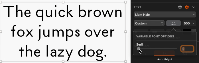
This website uses a font I created! It's a variable font that can slide continuously between sans and serif.
Try moving the slider at the top of the page (open the menu if you're on mobile) and watch the text change.
I make music (see Songwriting) under the name Liam Hale, and I designed a logo for it:
This logo uses contrasting colors and sans vs. serif to capture dualities that I try to express through my music:
- young ⇄ old
- modern ⇄ classical
- dark ⇄ light
- yin ⇄ yang
So I decided to expand on this concept and design a new font (called “Liam Hale”). Because it's a variable font, it isn't limited to expressing duality: it can vary continuously along the sans ⇄ serif axis.
If you're curious, here are some more details:
- I designed the font using Glyphs.
- I was inspired by the Baskerville font (one of my favorites!) and used that as the starting point for the serif master.
- I created a custom axis called
SRIFthat takes values between0(fully sans) and1000(fully serif). These correspond to the two different masters, sans and serif. (Variable fonts work by interpolating across multiple masters.) - Each glyph has exactly the same kerning in each master, so that they don't shift around when the value of
SRIFchanges. - I only designed a core set of glyphs (lowercase and uppercase letters, numbers, and basic symbols and punctuation), so the font won't work for all kinds of text. (I'd love to design more glyphs eventually, but it's incredibly tedious to do so. Designing this many took me many tens of hours.)
- I did not create masters for bold and italic styles, and yet to my surprise the font shows up reasonably well in bold and italic form on this website! I learned that this is because web browsers try to generate bold and italic styles when they don't exist — by literally shifting, overlaying, and angling the other masters.